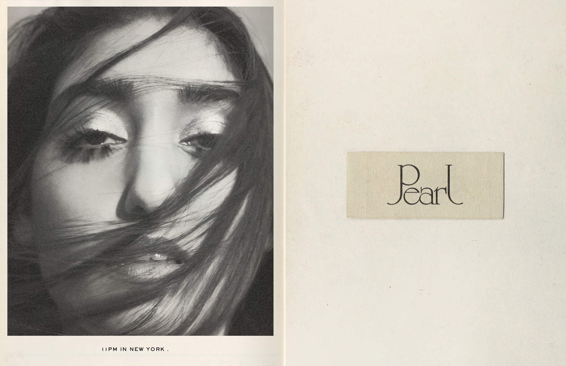


We wanted to create an identity that had as a starting point the DNA of the brand that was the 70s. One of the most recognizable characteristics of that time was the reinterpretation of the style of La Belle Epoque and Art Nouveau. We created a logo with elements of Celtic, Carlton and University Roman fonts.